

For quick workflows using dashboards, see QA and analytics. For in-depth performance analysis, see Performance monitoring.
Dashboards and tabs
Each tab is one dashboard. The Overview tab is the default dashboard. To add a dashboard, select + next to the tabs. You then pick one of these:
The first four options are templates. A template is a set of tiles that the platform creates for you. After you create the dashboard, the tiles belong to you. You can change, move, or delete any of them. A template saves you the setup work. It does not lock you in.
To manage a dashboard, select the ⋮ icon on its tab. You can rename it, edit it, duplicate it, set it as the default, or delete it.
The default Overview tiles
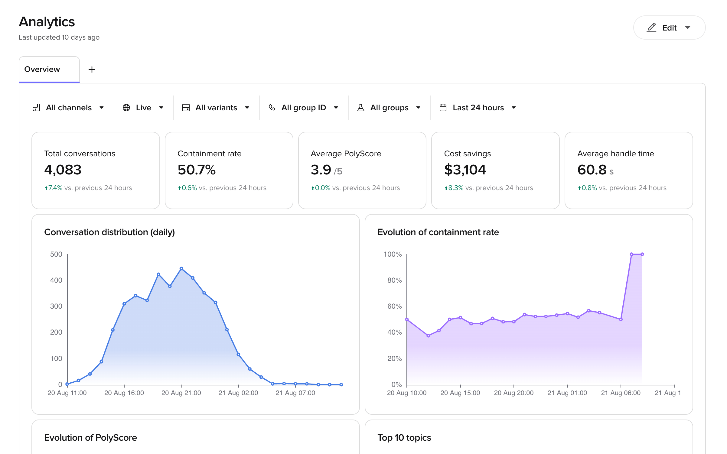
A new Overview dashboard starts with five headline numbers. Each one shows the change against the previous period of the same length.
It also starts with four charts: Conversation distribution (daily), Evolution of containment rate, Evolution of PolyScore and Top 10 topics.
Treat these as defaults, not as rules. Each tile is a metric, an aggregation and a format that you can open and change. For example, the Cost savings tile multiplies the total AI-only call duration by a rate per second. That rate is a field on the tile. If your agents cost more or less, open the tile and change it.
Filters
The toolbar above the tiles filters every tile at the same time.- Channels – voice or chat.
- Environment – where the conversations ran, for example
Live. - Variants – the site or location configuration. To compare an experiment’s versions, use Experiment version instead.
- Experiment – any experiment, running or finished. Past experiments stay in the list, so you can go back to their results.
- Experiment version – either Control, which is your Live version, or the Branch being tested, shown by its name. Choose an experiment first.
- Direction – inbound or outbound calls.
- Date range – a preset period, for example
Last 7 days, or a custom range.
Edit a dashboard
Open the editor
- Select the ⋮ icon on the dashboard tab.
- Select Edit dashboard.
- ← returns to the dashboard.
- + Tile adds a new tile.
- Save dashboard saves your changes. This button stays inactive until you make a change.
Rearrange and resize tiles
- To move a tile, drag the ⠿ handle to the left of the tile title.
- To resize a tile, drag the grip in the bottom right corner of the tile.
Add, edit and delete tiles
- To add a tile, select + Tile, configure it, then select Add to dashboard.
- To edit a tile, select the ⋮ icon on the tile, then select Edit. Select Update to apply your changes.
- To delete a tile, select the ⋮ icon on the tile, then select Delete.
What you can customise on a tile
The tile panel has three parts: Visualize as, the Data tab and the Format tab.Visualize as
Pick the tile type: Line, Bar, Donut, Table, Heatmap, KPI tile or Pie. You can change the type at any time. Your data settings stay in place. Switch between types to see which one reads best.Data tab
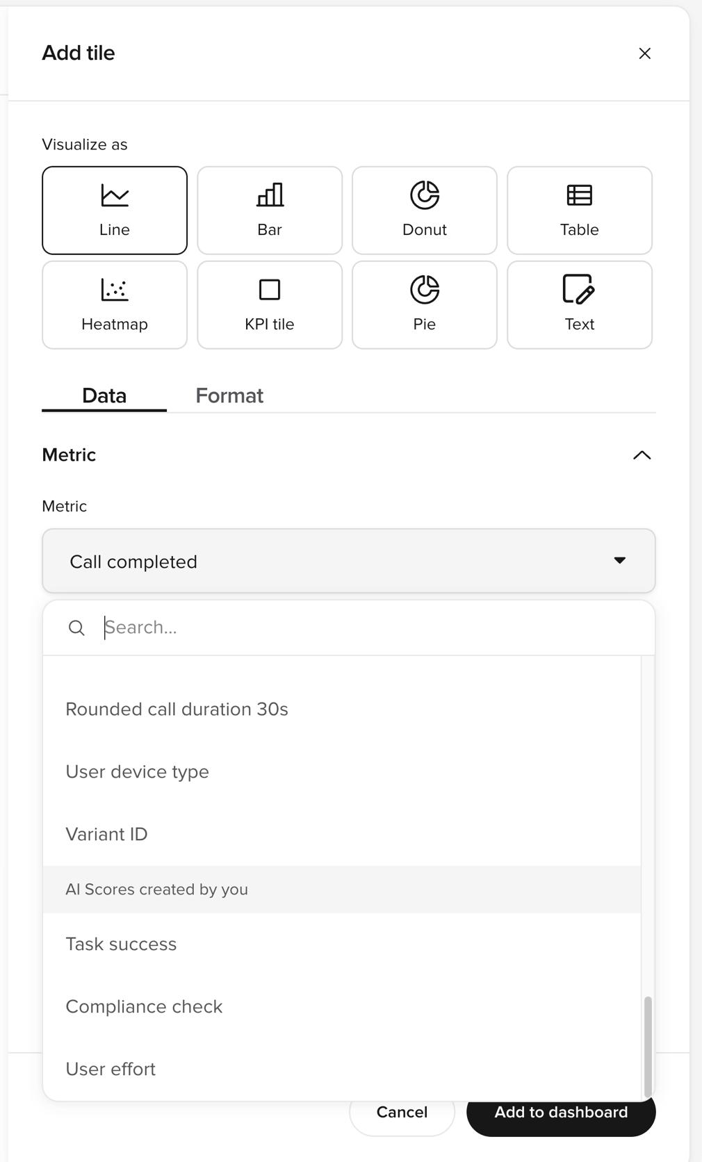
Metric — the value the tile measures. Select the Metric field to open the list of metrics. Use the search box to find a metric by name. The list groups the metrics under these headings:- Pre-built metrics — metrics the platform records for you, for example
Call durationorChat abandoned. - Metrics created by you — your custom metrics. This heading appears only when the project has custom metrics.
- AI Scores created by you — your AI Scores, listed by name. Scores that are turned off are still listed, so you can chart their past results.
Breakdown — splits the tile by a dimension. Set:
- Group by — the dimension to split by, for example channel or variant.
- Sort —
None,AscendingorDescending. - Limit results — the maximum number of groups to show. Use it for a top-10 chart.
Where condition. Add more conditions to narrow the tile further. This filter applies to this tile only. It does not change the other tiles.
For example, to count only conversations that the agent finished alone, filter on Where Handoff to Is not present.
Format tab
The options change with the tile type. For charts (line, bar, pie, donut, heatmap):- Chart title — the name shown on the tile. Rename tiles to match the words your team uses.
- Show area fill — fills the area under a line.
- Show gridlines — adds horizontal guide lines.
- Empty buckets — choose
Show as zeroorConnect pointsfor periods with no data. - Chart color — pick one of eight colours. Use the same colour for related tiles.
- Divided by — select a second metric to show the result as a rate.
- Y-axis label — the label on the vertical axis.
- Chart title — the name shown on the tile.
- Show change vs. previous period — adds the percentage change badge.
- Show as —
Number,Percent (%)orCurrency. - Multiply result by — a multiplier. Use it to apply a rate or convert a unit.
- Value suffix — a unit to show after the value, for example
s. - Divided by — select a second metric to show the result as a rate.
Percent (%). The tile then shows the first metric as a percentage of the second.
Table tiles
A table tile has its own settings on the Data tab:- Under Row, pick what each row represents:
Channel,Deployment,ValueorVariant. - Under Column, configure each column:
- Metric — the value in the column.
- Measured as — the aggregation.
- Show as —
Number,Percent (%)orDuration. - Divided by — an optional second metric, to show a rate.
- Filters (optional) — counts only conversations that match every filter you add.
- Select + Column to add more columns.