Creating a widget
From Widgets, click Add widget to open the Add widget dialog. (When no widgets exist yet, the page shows an empty state with the same button.) The dialog asks you to pick a Widget type first (Phone for Web Calling, Chat for Webchat), then fill in:A name to identify this widget (e.g., “Main website”, “Support landing page”).
The domain where this widget will load. The widget only renders on this origin. Embed attempts from other domains are ignored.
The variant this widget connects to. Use variants for location-specific or A/B-tested deployments.
Sandbox, Pre-release, or Live. You can promote a widget through environments without re-embedding.
Widget editor
The editor has three tabs: Styling, Content, and Embed. A live preview panel on the right updates as you type.Header controls
- Widget selector: switch between widgets in this project.
- Widget type indicator: shows whether you’re editing a Phone or Chat widget. Set at creation, can’t be changed later.
- Save and publish: deploy changes to the selected environment.
- Unpublished changes indicator: appears when the widget has unsaved or unpublished edits.
Styling tab
Match the widget to your brand. Some controls are shared, others are type-specific. The editor only shows the fields that apply to the widget you’re editing.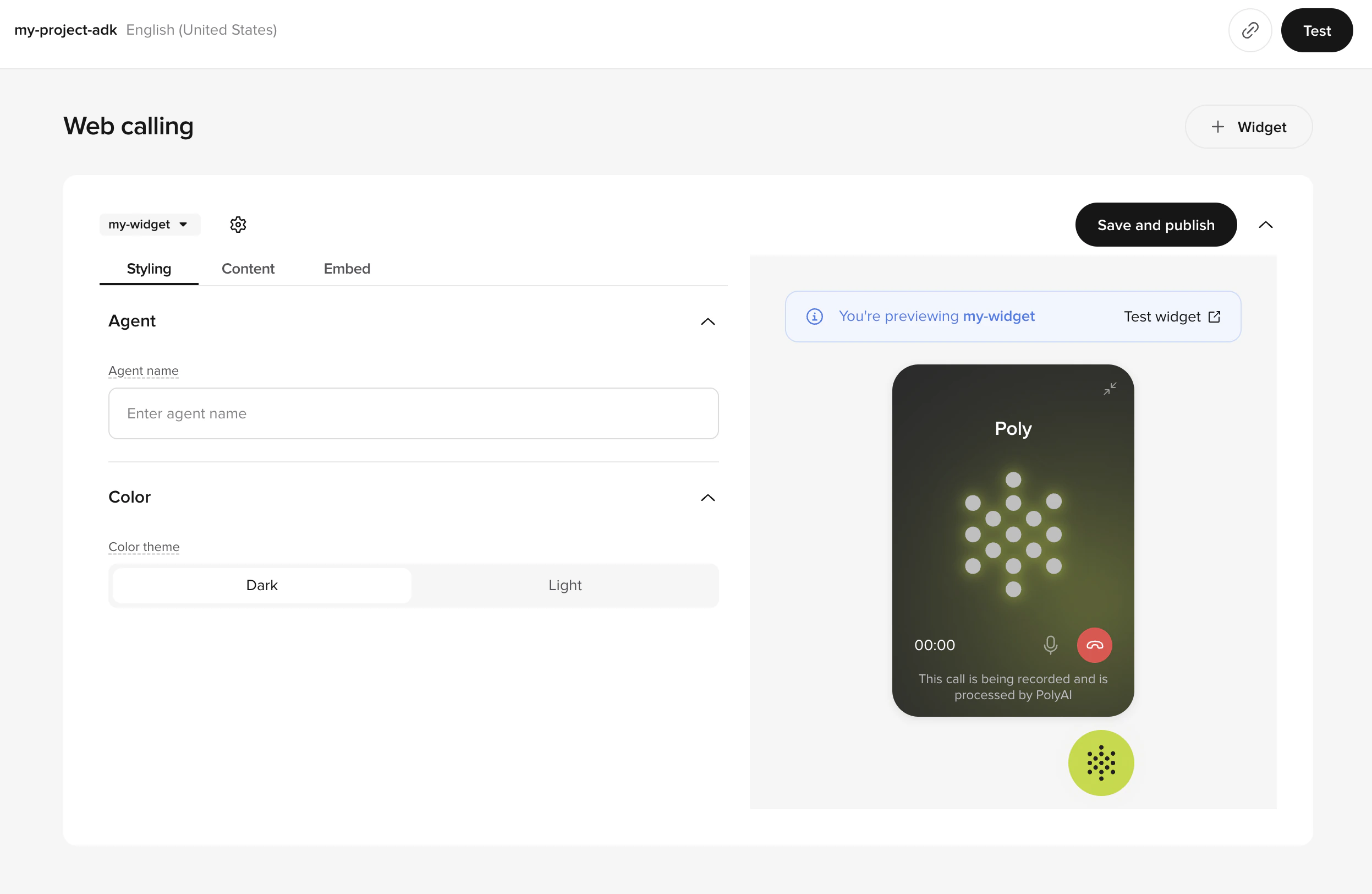
Styling tab with agent name and color theme controls
Shared
Display name for the agent (defaults to the variant’s agent). Used in both the call card (Phone) and the chat header / message rows (Chat). 1 to 50 characters. Example: “Emily”.
Phone-only
Choose between Dark or Light. This controls the widget background, animation, and buttons. Stored as
theme_color ("dark" or "light") on the Web Calling configuration. Custom hex values aren’t supported in v1.Chat-only
These fields appear only when the widget type is Chat:Accent color for suggestion bubbles, the widget button, header, and user chat bubbles. Enter a hex code. Example:
#c3da28. Stored as color on the Webchat configuration.The title shown in the chat header. Use your brand or product name. Example: “Acme Support”.
Optional. Logo or wordmark for the chat header. JPEG / JPG / PNG up to 2 MB. Min. 400 × 100 px (recommended 800 × 200 px). Choose a fit option of Fit (preserve aspect ratio) or Fill (crop to frame).
Optional. Avatar shown alongside agent messages. JPEG / JPG / PNG / static GIF up to 1 MB. Min. 128 × 128 px (recommended 256 × 256 px). Same Fit / Fill options.
Phone widgets don’t render a header logo or agent avatar. The call card is intentionally minimal so the focus stays on the live audio. Use the agent name and primary color to brand it.
Content tab
Write the copy your visitor sees when they open the widget: welcome message, CTAs, and your disclaimer.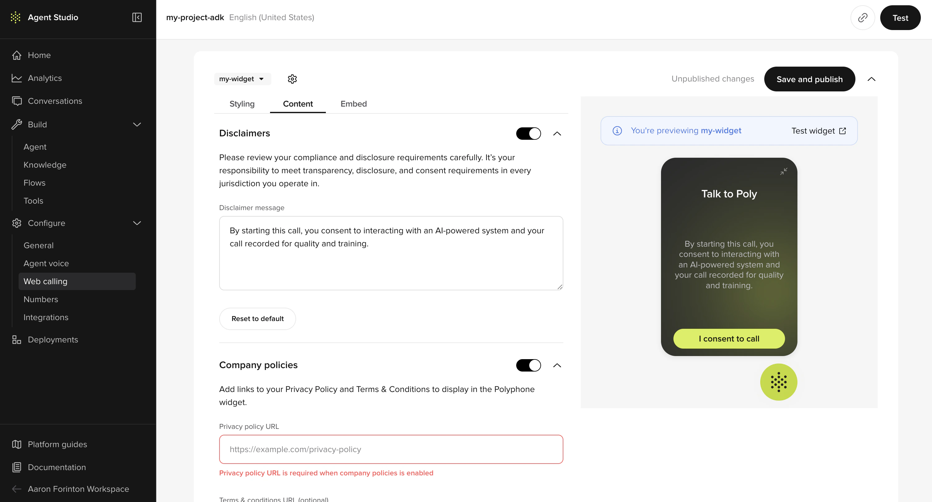
Content tab with disclaimers and consent preview
Welcome message
Shown on the widget’s start screen. Phone widgets default to “Hi I’m [agent name], how can I help today?”. For Chat, the conversation greeting comes from the agent’s chat configuration, not the widget. Up to 100 characters.
Phone-only: call-to-action labels
Primary CTA the visitor clicks to begin a call. Defaults to “Start call”. Up to 100 characters.
Label on the in-call hang-up button. Defaults to “End call”. Up to 100 characters.
For Phone widgets, transient call-state strings (e.g. “Connecting…”, “In call”, “Mute”) are not editable in v1.
Disclaimer and consent
PolyAI gives you optional controls for privacy disclaimer and consent. They’re off by default and easy to switch on when you need them.Toggle to render the disclaimer. When enabled, both policy URLs below become required.
Shown to visitors before they start. Up to 500 characters. Supports the inline link variables
Chat default: “This is an AI-powered system and responses should be verified. All chats are recorded in order to respond to your query and for training and quality control purposes.”
\{{privacyPolicyUrl}} and \{{termsUrl}}, which are replaced with the URLs you configure under Company policies.Phone default: “By starting this call, you agree to our Privacy Policy and Terms.”Chat default: “This is an AI-powered system and responses should be verified. All chats are recorded in order to respond to your query and for training and quality control purposes.”
Chat widgets only. When enabled, users must click “I consent and start chat” before the conversation begins.
Company policies
Required when the disclaimer is enabled. Must be
https://. Example: https://example.com/privacy.Required when the disclaimer is enabled. Must be
https://. Example: https://example.com/terms.Chat-only: launcher and behavior
Chat widgets expose extra runtime controls that don’t apply to Phone:
Phone widgets don’t have these knobs. The launcher renders with a fixed size, the call card is fullscreen on mobile only, and behavior is driven by call state rather than host-page config. See Install on your site for the full script-tag attribute reference.
Embed tab
When you’re happy with the widget, the Embed tab gives you a copyable script tag plus deployment guidance. Paste it into your site and you’re live.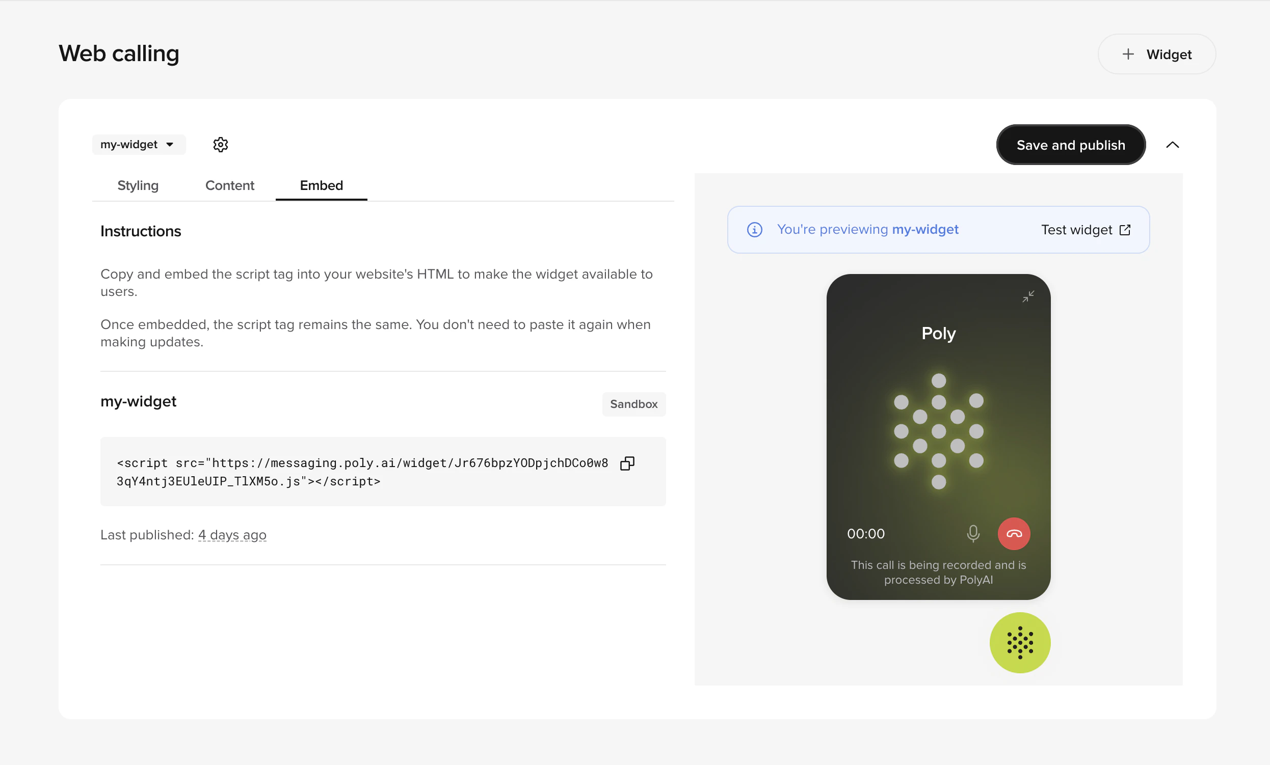
Embed tab with script tag and publish status
- Status: Live, Draft, or Archived.
- Script tag: paste before
</body>on your site. See Install on your site. - Last published: timestamp of the most recent publish to this environment.
- Snippet changed banner: appears when the published script tag differs from the current draft (your dev team needs to re-embed).
Saving and publishing
The publish button lives in the top-right of the editor. Widgets follow a draft → published lifecycle:- Edits are saved locally as you type and reflected in the live preview immediately.
- Click Save and publish to deploy to the selected environment.
- A confirmation modal asks you to confirm. Click Publish.
- A bottom-right toast confirms “Widget published”.
- The Unpublished changes indicator clears.
Permissions are scoped per widget type. Publishing a Phone widget requires write access on
polyphone_configurations; publishing a Chat widget requires write access on webchat_configurations. Read access on the same resources controls whether the Widget entry appears in the sidebar. Ask your admin if you can’t see the page.Live preview
The right rail shows a live iframe preview that updates as you edit. Confirm copy length, brand-color contrast, and disclaimer placement before publishing without leaving the editor. For Phone widgets, click Test widget to open a hosted preview page in a new tab where you can place a real call. See Test your widget.Managing multiple widgets
Spin up separate widgets for different domains, variants, or environments. Each gets its own branding and policies. Use the widget selector in the header to switch between them. Common patterns:- Per domain: different branding for
example.comandsupport.example.com. - Per region: a UK widget on a UK variant, a US widget on a US variant.
- Per environment: isolate a Sandbox widget for QA from your Live widget.
- Per type: a Phone widget on high-intent conversion pages, a Chat widget elsewhere.
Next steps
Install on your site
Embed the script via direct HTML or Tag Manager.
Test your widget
Hosted preview for stakeholder review.
Troubleshooting
Mic, network, CSP, and rendering fixes.